
Last month I was invited to write a “How to Draw Comics” guide for an incredible local event, Panel Explorations. It was a comics symposium featuring the likes of Stan Sakai, Phil Hester, Cullen Bunn, Eric Gapstur, Jeff Koterba, Allen Passalaqua and my good friend, Bruce McCorkindale. My work was featured in the program. I consider this a brief primer on how to draw comics. There are many great resources available. I hope someone finds it useful.
Drawing comics can be as easy and as cheap as you want it to be. All you need is paper and a pencil. But there are tools and methods that tend to work the best for many cartoonists. And they work best for the reproduction of your work. I’m going to go through some of these techniques with you here. I hope that you’ll find that your tools and your process will be unique to you. Pick and choose. Experiment at all times.
Traditional Tools
Comics got their start in newspapers. Newsprint is not the best paper for much of anything, let alone printing comics. But those early cartoonists figured out how to make their work reproduce on it. They discovered that line art in ink would make their comics clear and readable. Years later, that is by and large how comics are still produced.
Pencils
 Many cartoonists use a non-photo blue pencil to do their rough pencils. Refinements from their roughs are completed with a traditional pencil. The non-photo blue will not reproduce on a photocopier. You don’t need to worry about the accidental reproduction of your pencils with software. But people still like using it. Some cartoonists only do their pencils in non-photo blue.
Most of you are familiar with the old standard #2 pencil you used in school as children. There are a variety of pencils that can give you different effects. What we call the “lead” of the pencil is not lead at all, but a mixture of carbon and clay. The #2 pencil is actually an HB pencil. “HB” means that it is an equal mixture of carbon and clay. The “H” stands for “hardness”, and the “B” stands for “blackness”. You can buy different variances on this mixture to your heart’s content. I use a 4H pencil for my needs. More clay than carbon, it produces a light line. If you are trying to do your comics in only pencils to achieve a different look, I’d skew more towards “B” side.
Paper
Bristol board is best surface for your work. You can buy it in pads at any art store. Bristol has three different surfaces that range in tooth: vellum, smooth, and plate. Vellum has much more tooth and thus is more suitable for inking with a brush. Smooth and plate are great for dip or technical pens. I use smooth and vellum. Plate feels like I’m skating on ice. Too smooth for me. I do know some cartoonists that prefer it though. Strathmore is the standard brand. They make paper that ranges from 200-500 grade. The lowest I’ve gone is 200, which is cheaper and will do in a pinch. The 300 is available in most places and good for the price. The 400 and 500 is luxurious. If you spend a lot of time at the board, invest in good paper.
Ink
India ink is the standard ink used for comics. Speedball Super Black is the cheapest and easiest to find. It’s a good ink. Every cartoonist I know is always on the search for the perfect ink. It’s a never ending quest. I’ve never met one that has been completely satisfied with their ink du jour. Experiment. Try out different brands like Higgens, Kuretake, Deleter, J. Herbin, and Dr. Ph. Martin. If you are using a fountain pen, make sure you use fountain pen ink. A fountain pen will become clogged using standard India ink. Double check your ink for usage instructions.
Nibs and Dip Pens
 Dip pens are just a handle with a nib you stick in the end of the handle. You dip the nib in ink and apply your lines. The more flexible the nib, the harder it is to master. You can buy a sampler pack of nibs from Speedball that offers a variety of sizes for you to experiment with. The most popular nibs are the Hunt 102, which produces a fine line, and the Nikko G-nib. The G-nib is popular with manga artists, but Western artists are adopting it in droves as well. It produces a great line variation. I enjoy lettering with nibs. It takes some time to master it, but it’s satisfying and makes great letters. I hate inking with nibs because I feel like I’m always dipping and not drawing. There are G-nib pens which look like a fountain pen and act as such. They are refillable with a cartridge that moves away from that inconvenience. I haven’t had a good opportunity to use one yet.
I would say that most cartoonists I know use nibs. They are easy to control, they are cheap, and you can buy them in bulk. I admire their simplicity.
Brushes
Watercolor brushes are perfect for inking comics. They produce a large line variation, where you can move from thin to thick with the smallest gesture. The most common sizes are No. 1 and No. 2. The Windsor & Newton Series 7 is the Excalibur of brushes. It’s expensive, though. If you are just getting started, synthetic hair brushes are great. In fact, I’ve had a few Series 7’s and prefer the synthetics. They wear out quicker, but they don’t cost an arm and a leg. If you are using nibs, consider getting a synthetic brush for filling in large areas of black.
The brush is the most difficult tool to master in comics. Of course, that’s my tool of choice. Heaven forbid I make anything easy on myself (cartoonists are a sad lot). I have found that using a larger brush helps my lines. I use a No. 7, which is a hand cannon. But the larger bristles act like a shock absorber for my hand and produces smoother lines for me.
The Pentel Pocket Brush Pen is the best tool that straddles the line between brush and pen. It’s a convenient cartridge fill. I’ve inked a graphic novel with one when I was on a deadline. It’s great. I wasn’t able to get the line variance I prefer, but it did well. You can throw it in your pocket also and is great to carry with you everyday for your sketchbook.
Digital Tools
Even with traditional tools, you will likely have to add some digital tools into your process. And that’s not bad. Computers are amazing. They have taken difficult and labor intensive tasks and made them simple. My one word of caution is that the more you work in the digital realm, the less “human” your work may look. People relate more to work created by hand. That said, if it works for you, digital is a great way to go if you can afford it.
Scanners
You’ll want to get a scanner depending on the size of your pages. A tabloid scanner will work best since the standard comic size is in ratio to tabloid Bristol board. If you work larger than that, you’ll have to scan half your page at a time and stitch the scans together. Epson and Muratek make good tabloid sized scanners. I’m rather fond of Brothers line of multi-function printers. They have a tabloid scanner available. You can fax with it also. Have fun in the 1990s with that feature.
Computer
Getting a computer to help you with production is essential in the modern era of cartooning. If you are working digital, I would recommend an iMac or Windows desktop equivalent. You’ll want the larger screen size, RAM, processing power, and hard drive space. If you are using traditional tools, you’ll need to be able to scan your work, clean it, and do simple coloring. A laptop with a separate monitor attached will do fine for those tasks. It depends on your other computing needs. I have been using MacBook Pros with a monitor attached for the last 8 years. But I have found myself wanting more processing power. Now that I’m not moving around as much anymore, I find that my MacBook just sits at my desk. If you have a mobile lifestyle, consider a 15-inch MacBook Pro or Windows equivalent. Max out the RAM and hard drive space.
Tablets
 This is an interesting area right now. For a graphics tablet, you can’t do better than a Wacom. They have a variety of models, but they are all pretty much the same. I used to draw my comics with a Wacom Intuos and later, a Bamboo. The Bamboo was much smaller, but easier to throw in a bag. If you are more stationary, a Wacom Cintiq is the industry standard. It acts as a separate screen you can draw right on. Then there are the Microsoft Surface and iPad Pro with Apple Pencil. These are tablet computers that can double as graphics tablets. I connect my iPad Pro to my computer with a program called Astropad. It mirrors my computer screen onto my iPad. And the iPad also has a variety of native graphics programs that work well for comics. I’m a big fan of Procreate. The Surface acts as a full fledged computer with a pen stylus that works pretty well. There are no standards yet in this field. And it’s an expensive entry into comics. Again, it depends on what you are looking for. Traditional tools are cheaper, but more labor intensive. Digital tools are more expensive, but allow you to work faster. I use a mixture of the two. I draw, ink and letter my comics by hand. Then I scan and color in Photoshop. Thus, I can sell my original art later. If I’m working on a commercial project with a tight deadline, I may go all digital for that since I don’t own the work. But I find working digital to be less satisfying than when I work with traditional tools. I had an exclusive digital workflow for 10 years. I’ve only moved back to traditional tools in the last 4 years, and even then, it’s a hybrid process.
Process
 There are a myriad of ways to produce art for comics. I’d recommend not rushing in and making a plan of attack. The art is what makes a comic. A script is just a script. No matter how good it is, it is not a comic. The art is what makes the comic. It tells the story.
That said, the art should, in essence, be invisible. If at any point a reader leaves the story because of your art, you have failed. Everything should look like it belongs in the world you are creating. The art is in service of the story and should reflect that.
Thumbnails
If you are writing and drawing your comic, you are going to have a different perspective on how the story works. In this instance, I wouldn’t recommend “writing” a script. Try writing your comic as a thumbnail draft. Make it large enough for dialogue but small enough to so you don’t make the art precious.
If you are an artist working with a writer, I would start with smaller thumbnails and draft each page. Make note of word balloons and captions immediately. You can assign each piece of text a number. In your thumbnails add the corresponding balloon and mark it with that number. Why do we do this?
Writers don’t usually draw
Writers like to write. Sometimes too much. Less is more with comics. It’s graphic design and poetry combined into a new art form. It is your job to let the writer know if they have too much dialogue in a panel. Let them know if what they’ve written is going to work (or not). Thumbnail drafts are the best way to figure that out quickly. Newer writers will sometimes have two separate actions that happen in one panel sometimes. For example:
Panel 2: Matt gets up, walks to one end of the room to look out of the window onto the street, then turns when the phone rings. You can see the number 555-555-555 on the caller ID display.
Panel 2 as written above is more like 3-4 panels, not one. It’s a static image, not a movie. The more scripts a writer creates, the better they get at this. But you are the one who has to figure out Panel 2 isn’t going to work.
The other reason why you should work out your caption and balloon placements?
Don’t be a jerk
The biggest mistake I see in most comics is the art crowding out word balloons. You are either screwing yourself down the road, or you are screwing your letterer over down the road. The letterer has to figure out where to put word balloons and captions over your art. And they may obscure the action. It’s one of the most inconsiderate things an artist can do. You’re saying the art is more important than the writer’s words. And the letterer’s time.
Can you tell I’ve worked as a letterer for other artists before?
Don’t. Do. This. Make a plan. The balloons and captions are just as important as everything else on the page.
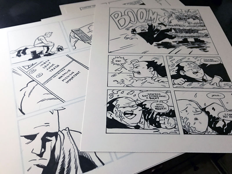
Pencils
You have your thumbnail draft. You’ve revised it several times. Send it to your writer, or if you are the writer, send it to someone else for review. Revise. Don’t be afraid of revising. When you complete your thumbnails, you are ready to start penciling.
Some people take those thumbnails and scan them in1. You can then use an image editor to blow up your thumbnails and print them out onto bristol. If you are working digital, you can just use them as your roughs. Build your pages from there in multiple layers.
 Don’t pencil your pages using your thumbnails as the end-all-be-all law. Sometimes panel compositions works different when you are working at a larger size. Most art is drawn on 11” x 17” bristol and reduced down to comic book size because the art tends to look better. Some artists work “at size,” meaning they draw at the same size as a comic book. There’s no hard and fast rule. I’ve found that working near 11”x17” is good for my body mechanics and my art. I don’t get hand cramps as often when I work bigger. When I work smaller, I tend to have sore hands and a stiff back. But I can get more pages done when I work smaller. But, working larger makes my art look better in the long run.
Lettering
I’m putting lettering between Pencils and Inks. I think it is good to get the lettering done before you go to final art. This way, you can revise your pencils if you need to with ease. Remember, the lettering is just as important as the art. If you are working with a letterer, this step usually comes after the inks and colors are done. If you are working on this by yourself, do yourself a favor and letter at this point.
Digital lettering is easy2. And if your work is getting translated for foreign editions, it’s the way to go. But I believe in lettering by hand. Here’s why: it looks like a human made it! Simple as that. Digital lettering with a font can become too slick at times, and has the potential to take the reader out of a story. If you haven’t figured it out by now, I believe lettering is as important, if not more important, as my art. It’s all part of the page I’m creating. If speed is of the essence, but you want to still hand letter your pages, try hand lettering them digitally. It works well. I’ve done it many times. Alex de Campi has an excellent post on how to do hand lettering digitally which mirrors my process.
I find lettering to be one of my favorite parts of the process. It’s relaxing to me to rule out my guidelines and letter a page. Even doing it digitally is fun for me. And once it’s done and my pencils look good, I move onto inks.
Inking
 Inking comic art is becoming a lost art. Part of it is because of digital processes and printing. Inking was integral to the comic-making process before digital technology. It made comics easy to reproduce and print on bad paper. Many cartoonists are now taking tight pencils into Photoshop and darkening them up. Or they are keeping their pencil lines loose and light and going to press with that. Modern printing presses can reproduce pencil lines now. And if you are working in a digital environment, you’re not dealing with ink in a true sense anyway.
But there is an art to inking in and of itself. It’s beautiful. For me, I think it enhances my art. I love big, thick, lush lines made with a brush. And if using actual ink makes you nervous, scan your pencils and ink digital. I learned to ink on a computer. Being able to hit “Undo” is wonderful while you’re learning. I’ve since transitioned to inking with a brush, but a decade of digital inking got me ready for that.
The goal of inking is to enhance the pencils and make it stand out. Inking is not tracing. If you are working with an inker, your work will look much different than the original pencils. They are bringing their own voice to the art, and it can work out in beautiful ways.
If you are inking your own work, grab a piece of Bristol and divide it into a grid. Then experiment with all your tools. Technical pens, nibs, brushes. Make marks with each tool in each box and try to achieve a different texture with each one. One or several tools will jump out at you to try if you are a beginner.
Scanning
Most cartoonists scan their original pages in as high a resolution as they’ll need. This is for backup purposes. I’ll scan my pages in at 1200 DPI (dots per inch) as a precautionary measure. After I’ve cleaned my page up in Photoshop, I’ll make a copy of it. I will convert that copy to another DPI depending on how it will be printed. If I’m printing in black and white, 600 DPI will work fantastic. If I’m printing in color, 300 DPI will be enough. The higher the DPI, the larger your file size.
When I scan my page, I’ll open it in Photoshop and save it immediately as a TIF with LZW compression turned on. I will give it a unique file name also. For example, it may be “MyComic- Page01.tif” and I will save in a folder named “Scans.” From there, I will follow these steps (presuming I scanned my page in Grayscale):
- Straighten the page out with the Ruler tool. I make sure the page alignment is correct.
- Crop to the edge of your panels.
- Reduce the page down to its print size. If you are working on 11”x17”, your art will need to be reduced around 60% or so. Use the Image Size function in Photoshop. Also, you can reduce your DPI here if you want. But when you adjust the DPI, the physical size in inches may go down as well, so pay attention to that.
- Adjust Levels to darken your inks and drop most of your stray marks.
- Clean up any stray marks with the Eraser tool.
- Adjust the Threshold. Default is 128. I usually go 156 or so. This makes your lines crisp. If you zoom in, they should be jagged, which is perfect. We want the lines to be crisp. And since we scanned at such a high resolution, when it prints, it will looks smooth.
- Convert the mode from Grayscale to Bitmap. Save again. Your file will be much smaller now.
If you used blue line pencil on your page, scan your page in CMYK. Between steps 3 and 4, go to your Channels palette and select only your Cyan channel. Select all and delete. Your blue lines should be eliminated. Then you can convert your mode to Grayscale.
If you are making a webcomic, I would make this file as print ready as I could. Stick with 300 DPI for coloring or 600 DPI for black and white printing. You will eventually want to print your comic, and you can’t do that with web ready files.
Coloring
 Let’s get something out here right away: you don’t have to color your comics. Most comics are in color. But if you are self-publishing, you may want to just stick with black and white. First off, It’s cheaper. Second, there is a beauty to black and white art. There is no place to hide with black and white. Coloring can hide a lot of sloppy mistakes.
That said, your comic will sell better if it is in color (or popularity if you are making a webcomic). Readers respond to color better.
Most coloring is done in Adobe Photoshop today. Some cartoonists create their work with watercolors, then scan them for reproduction. That’s an option. But Photoshop makes it easy for you to color your comic. There are countless resources online and in print on how to color comics, and there is no one right way. From a technical standpoint, you want to make sure there are no stray holes in the colors. And you want to make sure your black line work is trapping your colors underneath it.
- Open your cleaned page and convert it from Bitmap to Grayscale then CMYK.
- Double click on “Background Layer” to unlock it and rename it as “Line Art.”
- Create a new layer named “Base” and fill it with all white.
- Create a new layer under your artwork. Name it “Trapping.”
- Select all the white from your initial artwork layer with the Magic Wand tool and delete it. Then, select the black lines. Be sure the Magic Wand has the Contiguous box unchecked.
- Move to the Trapping layer and then go to Select > Modify > Contract. Reduce the selection by one pixel.
- Fill the selection with black.
- Create a new layer named “Color”. Turn off your Line Art layer.
- Select the Paint Bucket tool. Make sure the Contiguous and Sample All Layers boxes are unchecked. You can use a combination of the Paint Bucket tool and the Pencil tool to add color to your color layer. Use your Trapping layer as a guide.
When you are done coloring, you will want to change your trapping layer to another color. We will want to select our Line Art layer again and fill it with 100% K (“K” standing for Key or black). Then you will want to select your Trapping layer and fill the line work with another color. When this page prints, it will add richness to your flat black line art. You can do any combination with CMYK, but the only rule is to not have any black in it. So when you are picking a color, make sure that K is 0%.
Printing
Most printers today will want to have your final files arranged as a PDF. I recommend using Adobe InDesign to arrange your files. You can also use Adobe Acrobat. InDesign’s tools are much easier though. It’s straightforward since you are just placing artwork in order. No real secret tricks or tips. If you are printing it yourself, you’ll want to arrange it in spreads and then create a PDF with the Print Booklet feature in InDesign.
In all cases, speak with your printer, or someone who is working pre-press with your files. They will give you exact specifications for how they want your files. Ask away. Ask any and all questions you can think of. They’ll be more than happy to share their knowledge with you. It’s better for them if your files are right the first time around. And better for you. Getting multiple proofs back can be expensive for everyone.
Webcomics
Assuming you have a website already set up, you’ll want to use Adobe Photoshop’s Export feature to export two sizes of your comic. One at 72 DPI, and the other at 72 DPI but double the pixel size to account for high resolution screens. The file will be named “[email protected].” The “@2x” part means two times the actual size. If you are using a modern content management system (CMS) like WordPress or Grawlix, the system should understand that you are providing two different files for different resolutions. Media queries on the part of the CMS code send the right file to browsers.
Additionally, I would look at how your webcomic looks on your mobile devices. Are you planning for them? You should. More than half of all web traffic is now from a mobile device. Consider making different layouts to accommodate those devices. Again, you can switch out the same comic with different layouts via media queries in your CSS (Cascading Stylesheet) code.
Style
 Your style will find you, but you won’t find your own style. Not at first. Your style will be made up of all your influences and how you internalize them into your own work. When you are starting out, it’s good to copy other artists you admire. Freehand their pages and learn from them. When you feel like you’ve mastered what makes their pages work, find out who their influences are. Look at their work. Go back as far as you can. There are distinct schools of styles and cartooning that you can trace all the way back to the 1800s. Don’t be afraid of learning from them. Find out what tools they used. Try to mimic them as much as you can.
But you can’t. Not well. Your hands aren’t theirs. And that’s where your style starts to shine through. Your shortcomings will become your hallmarks. And what you learn from other artists. Soon, you will have a “style.” I put that in quotes because every cartoonist I know thinks they are a hack. They see all the people they learned from. And they don’t realize that they’ve created a style only they could possibly do. It’s unique to them. And strive for that. The more you draw, the less it looks like homage and more like your own work.
There are still days where I look at my work and say “that’s a Jim Lee jaw line.” Or, “man, this panel grid is a straight up David Lapham Stray Bullets page.” No one else is going to notice those details. And they are small details. I’ve internalized my influences until they’ve become part of my visual language. My work looks nothing like those artists’ styles. But I still feel a tinge of guilt when I recognize it. Ignore it. No one cares. All readers care about is the story.
Storytelling
Your art is telling the story. Make it as easy as possible on the reader. Study film theory and composition. There are similarities between film and comics. The goal of both mediums is to immerse you completely in the story. When the reader sees something that takes them out of the experience of the story, you’ve lost them. A lot of that comes from simple mistakes like tangents or breaking the 180 degree rule. When you are starting out, keep your storytelling as clear and simple as possible. Don’t do trick layouts. Stick with the basics: 6-9 panel grids. Every tier (row of panels) is a sentence, and every page a paragraph to the story you are telling. Plan on page turns. Direct the reader’s eyes towards turning the page. Use that page turn for revelations or shock. Take advantage of the format you’re working in.
Look at everything
Don’t ever just read comics. Read books. Watch movies and TV. Study paintings. Take a life drawing class. Listen to people. Go to a retirement home and strike up a conversation. If you travel abroad, take a pack of cigarettes with you, even if you don’t smoke. You’ll meet people with those cigarettes. Be a student of the world. All of it will influence your art and give you insight into the creative process. Being an artist is opening yourself up to the world around you in all its ugliness and beauty. Learn to see it. Really see it. And then be ready to recall it and put it into your work. See it, and don’t ever look away.
- ↩︎You’ll probably want to do this anyway just so you have a backup copy. Always be prepared for something to go wrong.
- ↩︎It is not without rules though. Learn more about lettering from Blambot.com and Balloontales.com.