
It’s time. Time to start putting all of that great content you’ve created online. Makes sense, right? It’s good. It’s well-written. And it could help keep your website fresh. It could even help with SEO. There’s just one mental hurdle you can’t get over—it doesn’t look as good online as it does in your printed materials.
You fiddle. You fudge. You make soft breaks in text to avoid orphans. You justify large blocks for better reading. And then you look at your post on your phone. It looks horrible. How? Why?! It looks great on your laptop!
You start wrapping text in header tags to draw emphasis. Then you start trying to use inline CSS to fix it. It’s like putting out the fire with gasoline. Your SEO starts taking a dip. Your entire site layout is now breaking on mobile and desktop. What are you going to do?
Embrace the Zen of the Web.
Let Go of Comparing
The Web is not Print. The Web is not Print. The Web is not Print. Keep repeating that to yourself.
With any printed piece, you have physical dimensions that you can work with. And you work within those dimensions to achieve the best design for your content. With a website, you have to account for all of the screens that have ever been made in all of the existence of human history past, present, and future. It’s an impossible task.
So don’t. Don’t compare it to print. Embrace the web for what it is. Don’t try to constrain your text to fit a certain size. Let it flow to the size of the screen. Use CSS screen media queries to adjust your text depending on the size of the device it’s being viewed on.
Let Go of Judgments
No one likes widows, orphans, or rivers in your text. It’s amateurish in print and leads to poor reading. But trying to accommodate those rules on the web can problematic. Fixing them can lead to inadvertent widows and orphans on different screen sizes. And you can justify your text. But unless you want to put in hours and hours of labor to adjust each line for every device, you’re losing money. Keep it simple. We’ve all been reading online for over 20 years now. Trust your audience, and give yourself a break.
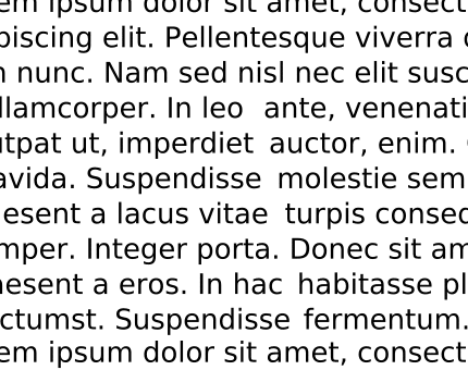
River example by Jeff Dahl – own work, GFDL
Orphan typesetting example
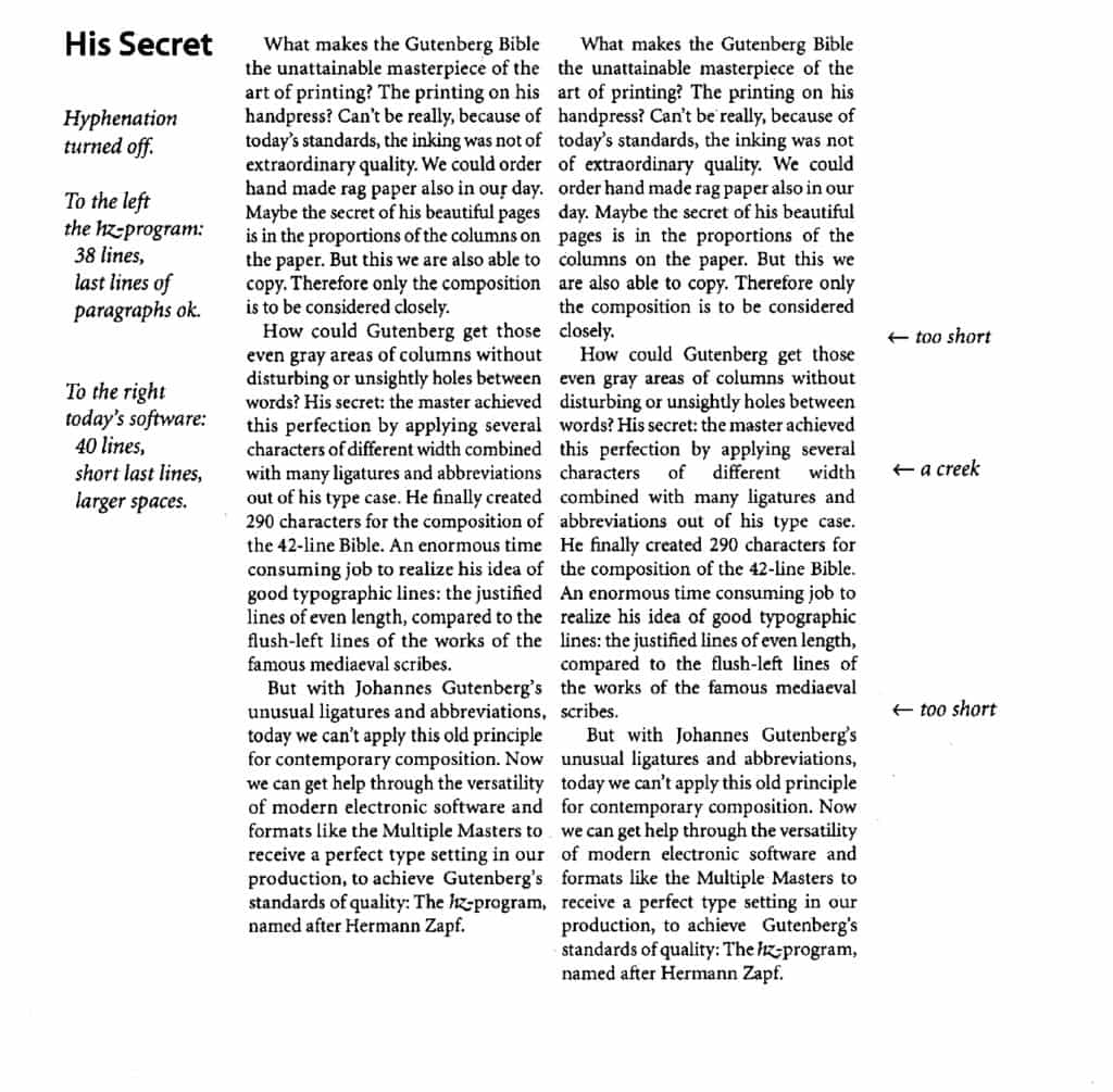
Justification example by Volker Schnebel – own work, CC BY-SA 3.0
Let Go of Anger
Forcing inline styles onto your text to replicate print can be fun in small instances. Like a blockquote style, for example. But if you try to force each headline, each callout, each quote to be “perfect,” you’re setting yourself up for an angry day. You’ll be angrily adding all of those styles on the day you are doing them. You’ll be furious several months later when you go in and try to edit your content. And you will have a nuclear meltdown when you either redesign your site or move to a different CMS. You’ll have to rip your hard work out. Not only that, you run the risk of breaking the entire site design structure with inline styles. What’s more important? This headline or your website? Go the extra distance for special occasions, but don’t let it be war all the time.
Let Go of Worrying
What about using different HTML tags instead of inline CSS? Adjusting the size of a headline by using a different header tag can work. But what if that headline contains keyword terms that your customers are looking for? If you make that headline an <H5>, sure, it’s smaller. But now it weighs less than an <H1> in terms of SEO. The same is true with manipulating your text in <div> tags instead of <p> tags. Well-structured markup has positive SEO effects. So don’t worry about making it look perfect. Wrap your content in the appropriate markup. Make it as easy as possible for it to get indexed.
Let Go of Fear
You can’t control the web. Design trends change, and SEO tactics change almost daily. But the one thing that doesn’t change is that good content is rewarded. Either by clicks or high rankings in search engines. Preferably both. So don’t be scared about doing the wrong thing. Instead, do the right thing. Write good content. Make sure it looks good on as many devices as possible. Don’t try to make it look like print. Make it look like it belongs on the web. You will be rewarded for it.
This was originally published on the B² Interactive blog. Illustration by Katie Kassel.