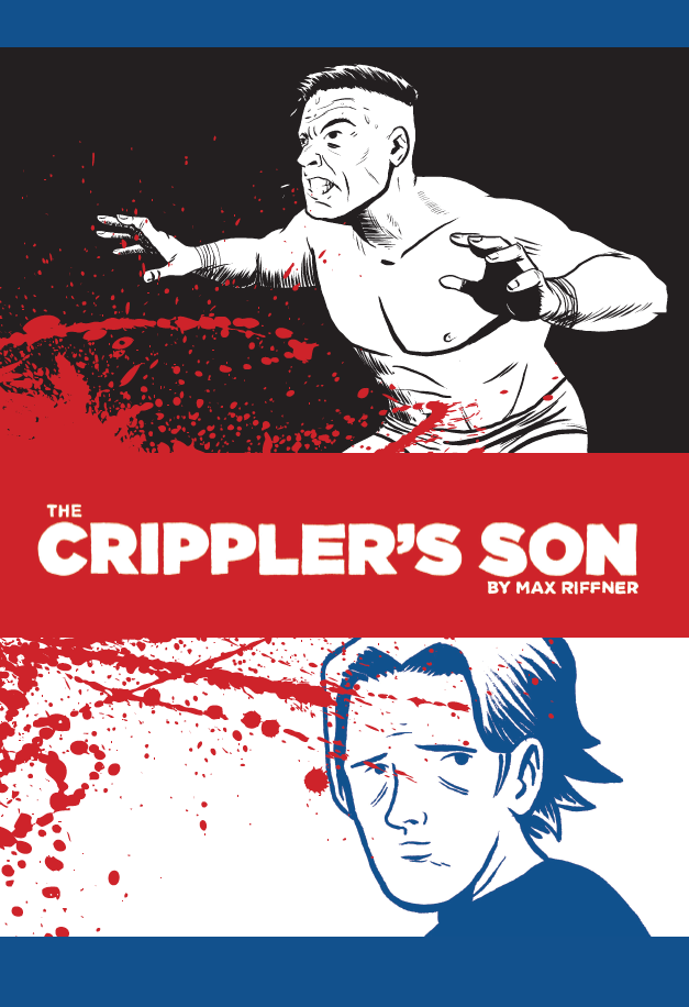

I had one month to complete my thesis to graduate from the Center for Cartoon Studies. This is my process for how to draw a 50 page comic in a month. I hope someone can use the information in their creation process.
Every class at the Center for Cartoon Studies has to complete a thesis to earn a degree. That thesis must prove a year’s worth of work. For most cartoonists, that means about 40 to 90 pages of all killer, no filler work. One of the benefits of my experiences is that I know almost to the hour how long a project will take me. Years of tracking my time at advertising agencies to the quarter hour pays off. I spent 9 months making thumbnail drafts of my 50 page story (about 10 in all). I knew I could blast through the art. Yet, the professors knew that I could do that also. It was a calculated gamble that paid off. I graduated, and my thesis is now published by Fantagraphics. By spending over a year refining my story, I was able to settle into the act of drawing it. And I used every cheat, hack, and shortcut I could think of to get it done.
Use the following at your own risk. This worked for me because I knew exactly what each page would look like after so many drafts.
How To Draw Comics Quickly!
 Panel Layouts
 Panel Layouts
Adobe Illustrator is not my favorite tool, but it is my best tool. I made all my panel layouts on Illustrator documents 150% larger than print. Make the panel borders black; this will save you headaches later. I didn’t have time to do them by hand, but it won’t matter anyway.
Lettering
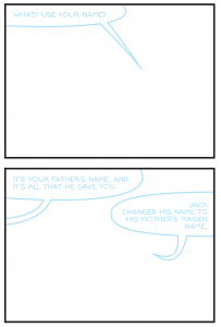
In the same Illustrator documents, I created all my word balloons and lettering. But I set them to 30% Cyan. I created four fonts based on my own hand lettering from MyFonts.com for free. They have specials and coupons if you look. Each one varied for different effects. I also created all my sound effects here also using the same technique.
Sidenote: the fonts generated by MyFonts.com have atrocious kerning. You’ll see it right away once you start typing. Set your type from Metrics to Optical, so each letter gets an equal amount of space around it.
Print at Size
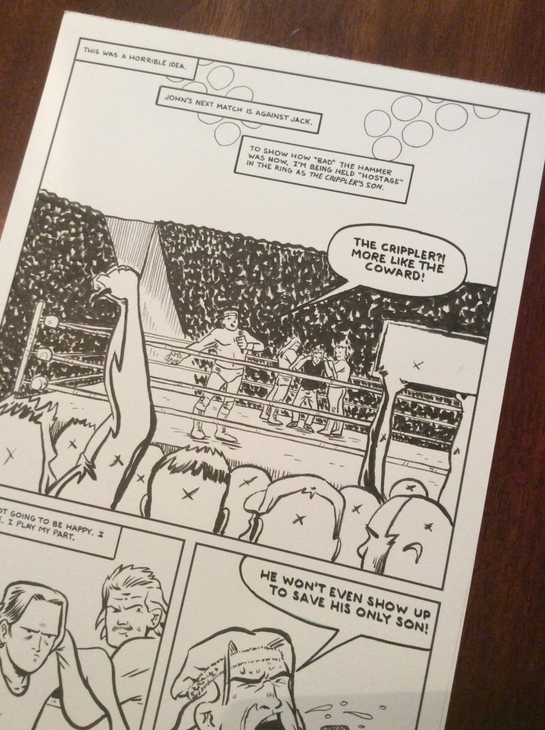
I then made a PDF in InDesign of my entire story with my Illustrator files. A friend volunteered his printer, which is capable of printing on bristol board. I’d get them ten at a time so I wouldn’t get overwhelmed.
Handlettering
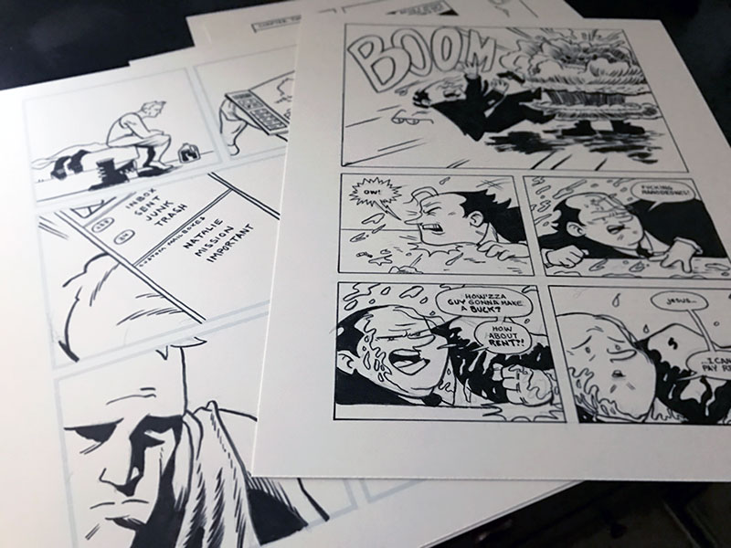
Once I got the boards, the first thing I would do is sit down and letter each page. For speed, I used a .08 Micron, and a Brush Nib Micron for bold letters and balloons. Normally, I’d letter with a nib, but speed is of the essence here, remember? I didn’t have to use an Ames guide to rule out my lettering either. The font was already my handwriting and kerned. Added bonus: I was able to spell check everything first also. Handlettering just sings off the page in a way that a font won’t.
No Fills
My story contained a great deal of spot black. One reason was because I’m obsessed with graphic spot blacks. They add weight to the page aesthetically and from a storytelling perspective. The other reason was another cheat. When I had my pencils done, I inked over them with a Pentel brush pen. Again, not dipping in an inkwell saves a lot of time. I also left my blacks open. I would fill them in Photoshop once I scanned and cleaned up.
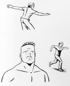
Replacement drawings for bad panels.
Scan as you go
Once I had a page done, I’d scan it immediately. When I finished scanning all my pages, I cleaned and filled blacks. It’s easier for me to just do them all at once. I always start to notice inconsistencies much better that way. I will be better able to fix them when I look at all the work.
That’s the basic plan! Once the art was all done, I made a PDF and didn’t look at it for a week. That’s enough time to disassociate yourself from the art. I had a more balanced take on my work then. I did extra panel corrections after that time had passed.